Key Takeaways:
- Color often decides the sale. Roughly 85% of shoppers say color is the main reason they choose one product over another, making it one of the most influential factors in a purchase decision, not just a design detail.
- Consistency drives recognition. Sticking with one signature color across your logo, packaging, and website can boost brand recognition by up to 80%, but only if you resist the urge to change it frequently.
- Each color carries a distinct emotional signal. Red drives urgency and appetite, blue builds trust and calm, yellow signals optimism, green suggests health and growth, and black or white conveys simplicity and luxury.
- The exact shade matters as much as the color family. A muted red reads completely differently from a bright red, and a sage green feels different from a neon one, so tone selection is just as important as the base color choice.
- Limit your palette for maximum impact. Two or three colors plus a neutral tend to look more intentional and professional than a crowded palette with five or six competing hues.
- Accessibility and context can’t be ignored. Poor contrast can make text unreadable for a meaningful portion of your audience, and colors can look very different across screens, print, and physical signage.
- Avoid common execution mistakes. Chasing trends, overusing colors, copying competitors too closely, and switching palettes often all work against the recognition benefits that consistency provides.
Picking a brand color can feel like a small decision until you realize it is often the very first thing a potential customer notices about you. Before they read your tagline, scroll your services, or check your reviews, they see color. That split-second visual impression shapes whether they feel curious, trusting, excited, or completely indifferent. This guide breaks down what the major brand colors communicate, backs it up with fresh 2026 research, and gives you a practical framework for choosing a palette that actually fits your business.
Most business owners spend weeks agonizing over a logo shape or a tagline, then pick a color almost as an afterthought, often just going with whatever their designer suggests or whatever looks good on a mood board. That approach skips over one of the most measurable levers in branding. Color is not just an aesthetic choice, it is a communication tool, and like any tool it works better when you understand what it is actually doing.
Why Color Is the First Thing People Judge You On
Human brains process color faster than they process words or shapes. That is not a marketing myth, it is basic visual perception. Before a customer reads a single sentence of your website copy, your color palette has already started forming an opinion in their head. This is why so many well-known companies protect their brand colors as fiercely as their logos or slogans.
For a small business or a solo founder, this matters even more. You may not have the marketing budget of a national chain, but you can absolutely control what your color palette says about you. A thoughtful color choice does a chunk of your branding work before you even open your mouth.
Think about how quickly you can identify a familiar brand from a single color swatch, even with no logo or text attached. That instant recognition is not an accident, it is the product of years of consistent color use reinforcing the same visual cue over and over. Smaller businesses can build that same recognition much faster than people assume, as long as the color choice is deliberate and stays consistent across every touchpoint, from packaging to social media to the sign above the door.
What the 2026 Data Actually Shows
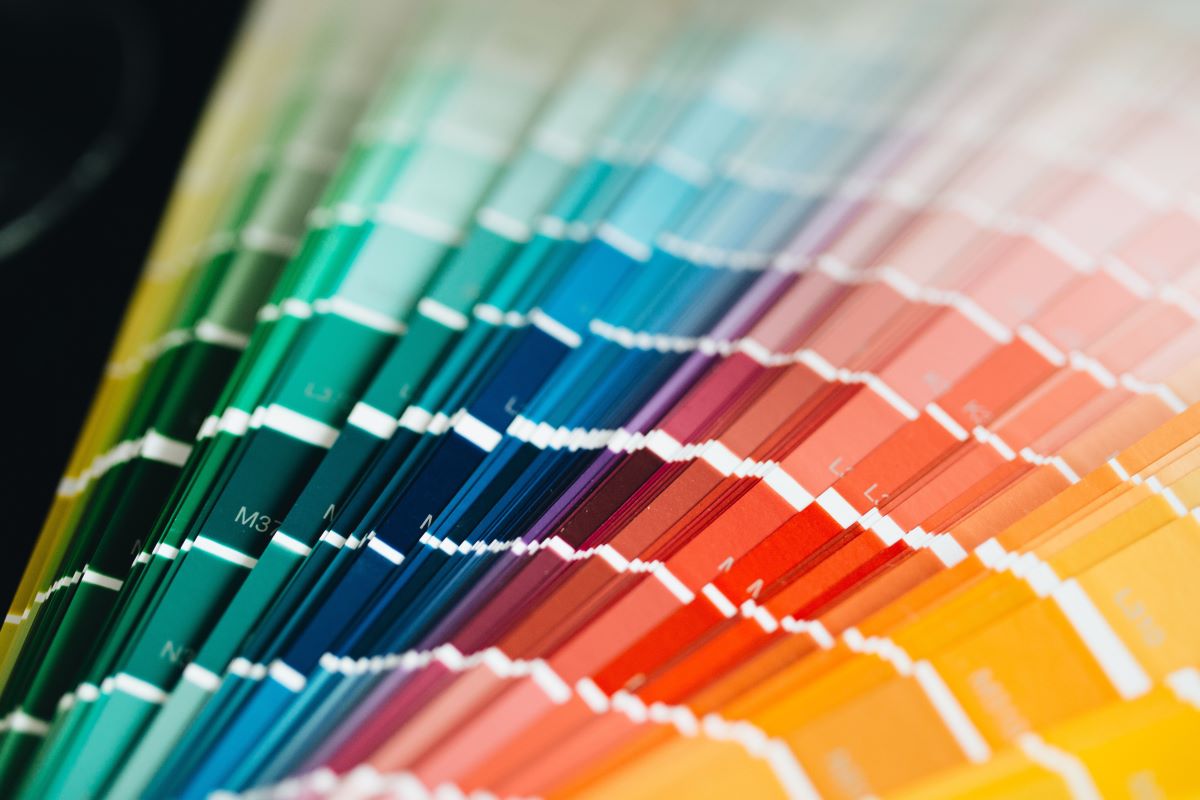
Two recent studies give a clear picture of just how much weight color carries in 2026, and they come at the question from different angles.
The first comes from Colorlib’s 2026 color psychology report, which pulled together more than seventy statistics on how color influences buying behavior. One figure stands out above the rest: the vast majority of shoppers, roughly eighty five percent, point to color as the main reason they chose to buy a particular product over another. That is not a minor influence, that is color acting as the deciding factor in most purchase decisions.
The second data point comes from WiserNotify’s 2026 branding statistics report, which compiled figures from primary research and industry studies published within the last two years. According to their findings, having a consistent signature color can lift brand recognition by as much as eighty percent. In other words, a business that sticks with one distinctive color across its logo, packaging, website, and signage becomes dramatically easier for people to recall and identify later.
Put these two data points together and the takeaway is straightforward. Color is not just decoration, it is one of the strongest levers you have for both winning a sale in the moment and being remembered afterward. A palette that is chosen carelessly, or changed every few months, works against both of those goals.
What makes these two figures especially useful together is that they cover two completely different stages of the customer relationship. The Colorlib figure is about the moment of decision, the split second when someone is standing in an aisle or scrolling a product page deciding whether to click buy. The WiserNotify figure is about everything that happens after that first purchase, when a customer needs to recognize you again among dozens of competitors fighting for the same attention. A business that only optimizes for one of these moments is leaving value on the table. You need a color that performs in the moment and a color that sticks in memory, and in most cases those turn out to be the same color, just applied consistently over time.
Red: Energy, Urgency, and Appetite
Red is one of the most physically stimulating colors on the wheel. It raises heart rate and grabs attention faster than almost any other hue, which is exactly why it shows up so often in food branding, clearance sales, and call-to-action buttons.
- Common associations: excitement, urgency, passion, appetite
- Works well for: restaurants, fast food, clearance and retail sales, entertainment brands
- Watch out for: overuse can feel aggressive or overwhelming, especially in large blocks
Brands that want customers to act quickly, whether that means grabbing a snack or clicking “buy now,” often lean on red because it genuinely pushes people toward faster decisions. It is worth noting that context changes how red reads. A deep, muted red on a fine dining menu communicates something entirely different from a bright, saturated red on a discount sticker, so the exact shade you choose matters just as much as the color family itself.
Blue: Trust, Calm, and Reliability
Blue is consistently rated as the most popular color across genders and cultures, and it carries a reputation for being dependable rather than flashy. That is exactly why so many banks, healthcare providers, and tech companies build their identity around it.
- Common associations: trust, security, professionalism, calm
- Works well for: financial services, healthcare, insurance, B2B software
- Watch out for: overly muted blues can come across as cold or impersonal
If your business lives or dies on customer trust, meaning people need to feel safe handing over money or personal information, blue is one of the safest and most effective starting points. The tradeoff is that blue is also one of the most heavily used brand colors out there, so businesses that go this route often need a distinctive shade, a strong secondary color, or a unique visual style to avoid blending into the sea of other blue logos in their industry.
Yellow: Optimism and Attention
Yellow is the color of sunshine and caution tape at the same time, which tells you a lot about how flexible and attention-grabbing it can be. Used well, it signals warmth and positivity. Used poorly, it can feel jarring or hard to look at for long periods.
- Common associations: optimism, friendliness, youthfulness, affordability
- Works well for: children’s brands, budget-friendly products, food and beverage accents
- Watch out for: pure yellow can strain the eyes on screens, so it usually works best as an accent rather than a dominant background
Small businesses that want to feel approachable and upbeat, rather than corporate or serious, often find yellow does a lot of that emotional work automatically. It also pairs unusually well as a supporting color rather than a headline one, since a small dash of yellow in a button, icon, or highlight can draw the eye exactly where you want it without dominating the overall design.
Green: Growth, Health, and Sustainability
Green is tied closely to nature, which makes it the default choice for anything related to wellness, sustainability, or financial growth. It is also one of the easiest colors on the eyes, which is part of why it works so well for long reading sessions or apps people use daily.
- Common associations: health, nature, growth, sustainability, calm
- Works well for: wellness brands, organic and eco-friendly products, financial growth apps, outdoor businesses
- Watch out for: darker or muddier greens can read as dated, so shade selection matters a lot here
If part of your brand story involves sustainability, natural ingredients, or financial progress, green often reinforces that message without you having to say a word. Because green covers such a wide emotional range, from earthy and organic to sleek and modern, the specific tone you pick does a lot of heavy lifting. A muted sage tends to read as calm and natural, while a bright, high-saturation green reads as energetic and tech-forward.
Black and White: Simplicity and Luxury
Neither black nor white is technically a color in the traditional sense, but both carry enormous weight in branding. Black signals sophistication, exclusivity, and confidence, while white signals cleanliness, simplicity, and openness.
- Black works well for: luxury goods, high-end fashion, premium tech products
- White works well for: minimalist brands, healthcare, modern design studios
- Watch out for: an all-black or all-white palette with no accent color can feel flat or generic without a strong secondary element to anchor it
A lot of premium brands use black or white as a base and then add one bold accent color to keep the palette from feeling lifeless. This combination also tends to age well, since neutral palettes do not go out of style the way trendier color trends can, which makes black and white a practical long-term choice for businesses that want to avoid rebranding every few years.
Purple and Orange: The Personality Colors
These two colors do not get talked about as often, but they carry very specific personalities that can be a great fit for the right business.
Purple has long been associated with royalty and luxury, and today it also reads as creative and imaginative, which is why it shows up frequently in beauty brands and creative agencies. Orange, on the other hand, blends the energy of red with the cheerfulness of yellow, making it a favorite for brands that want to feel confident, friendly, and a little bit bold without going full red.
- Purple works well for: beauty, luxury, creative and artistic services
- Orange works well for: fitness brands, youth-focused products, calls to action that need warmth rather than urgency
Neither color is as common as blue or black, which can actually work in your favor if you want to stand out in a crowded market. Because fewer competitors use these colors as a primary identity, businesses that do often find it easier to claim visual ownership of the color within their specific niche, which reinforces the recognition benefits discussed earlier.
Pairing Colors So They Work Together, Not Against Each Other
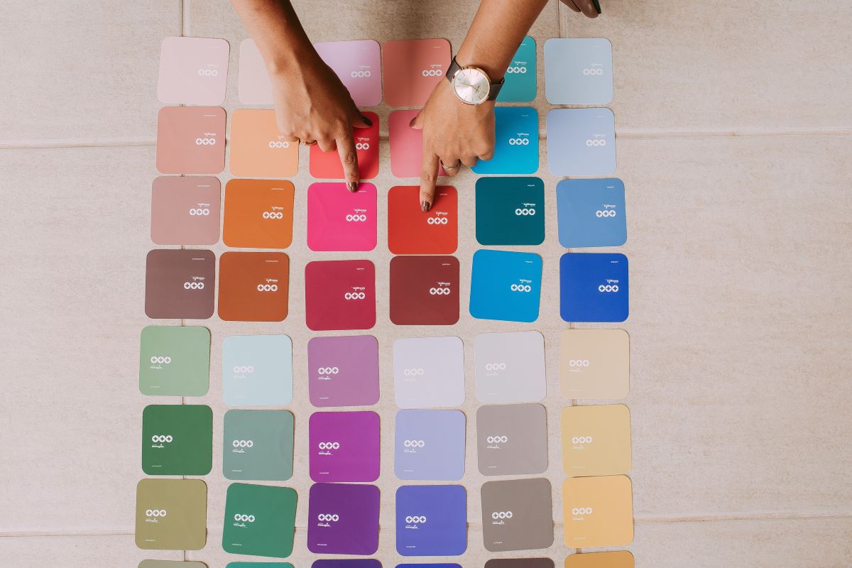
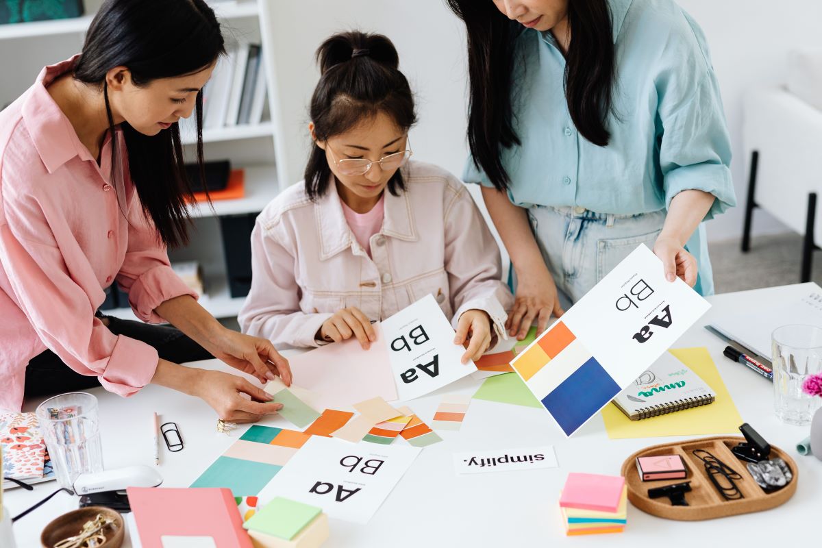
A single color rarely carries a brand on its own. Most strong identities are built on a primary color plus one or two supporting colors that either contrast for attention or complement for harmony. Getting this pairing right is often what separates a brand that looks professional from one that looks like it was assembled without much thought.
- Complementary pairings, like blue and orange or red and green, sit opposite each other on the color wheel and create high contrast, which works well for calls to action and anything that needs to stand out immediately.
- Analogous pairings, like blue and green or yellow and orange, sit next to each other on the wheel and create a softer, more cohesive feel, which tends to work well for lifestyle and wellness brands.
- Neutral anchors, like black, white, or gray, give a bold primary color room to breathe and prevent a design from feeling too busy or overwhelming.
- Limiting your core palette to two or three colors, plus a neutral, tends to look more intentional than a palette with five or six competing hues.
The goal is not to memorize color theory rules, it is to make sure your supporting colors reinforce the emotional message of your primary color rather than fighting against it.
How to Choose the Right Color for Your Business
Picking a brand color is not just about personal taste, it is about matching a color to the emotional response you want customers to have. Here is a simple process to work through:
- Start with your industry norms, then decide if you want to fit in or stand out. Financial services leaning blue is a norm for a reason, but a bold departure can also work if executed well.
- Think about your customer’s emotional state when they interact with you. Someone booking a spa day wants calm, someone shopping a flash sale wants urgency.
- Test your primary color against a neutral background and an accent color before committing. Colors behave differently depending on what surrounds them.
- Check accessibility and contrast, especially for anything used online, since poor contrast can make text unreadable for a meaningful chunk of your audience.
- Consider your physical presence too. If you have a storefront, office, or signage, your color choice plays a real role in improving business curb appeal, since it is often what catches a passerby’s eye before they ever read your sign.
Once you land on a primary color, resist the urge to constantly tweak it. Consistency is where the real recognition benefits come from, as the 2026 data on signature colors makes clear.
Common Color Branding Mistakes to Avoid
Even businesses that understand color psychology can trip up in the execution. A few patterns show up again and again:
- Choosing a color because it is trendy rather than because it fits the brand’s personality
- Using too many colors at once, which dilutes recognition instead of building it
- Ignoring how the color looks across different mediums, since a color that looks great on a screen can look completely different printed on a sign or packaging
- Switching brand colors frequently, which resets the recognition clock every time
- Copying a competitor’s palette too closely, which can create confusion rather than differentiation
Avoiding these mistakes is often more valuable than finding the theoretically perfect color, since consistency and clarity tend to outperform perfection. It is also worth remembering that no color choice happens in a vacuum. Cultural associations with color can shift depending on the market you are selling into, so if you plan to expand internationally, it is worth double checking that your chosen palette carries the meaning you intend in every region you plan to operate in.
Bringing It All Together
Color is doing more work in your branding than most business owners give it credit for. The 2026 data makes a compelling case on both ends of the customer journey: color heavily influences the initial purchase decision, and a consistent signature color makes your brand dramatically easier to recognize afterward. Whichever color you land on, treat the decision with the same care you would give your logo or your name, because in many cases, it is the very first impression your business makes.